Loading
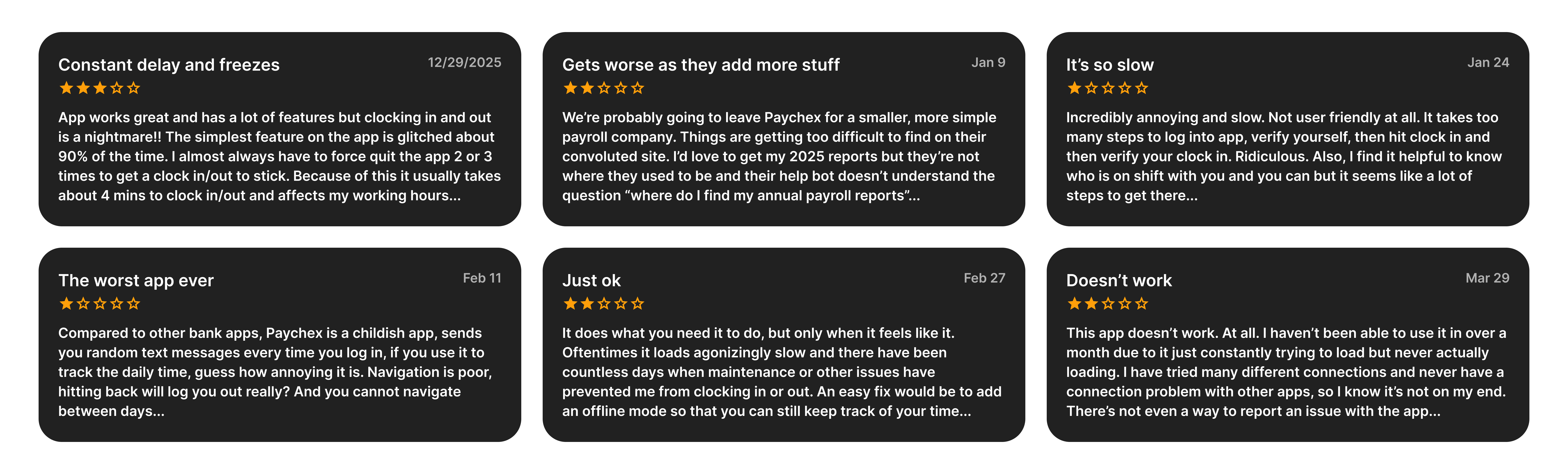
While our enterprise mobile app achieved massive scale—boasting $8M+ downloads and strong 4.6/4.8-star ratings—recent qualitative feedback for our utility-heavy enterprise tool indicated a sharp decline in user satisfaction. Power users were experiencing friction with rigid navigation, system stability, and an increasingly unintuitive interface.
Our goal was to resolve these core usability gaps and deliver the reliable, seamless experience our users depend on.
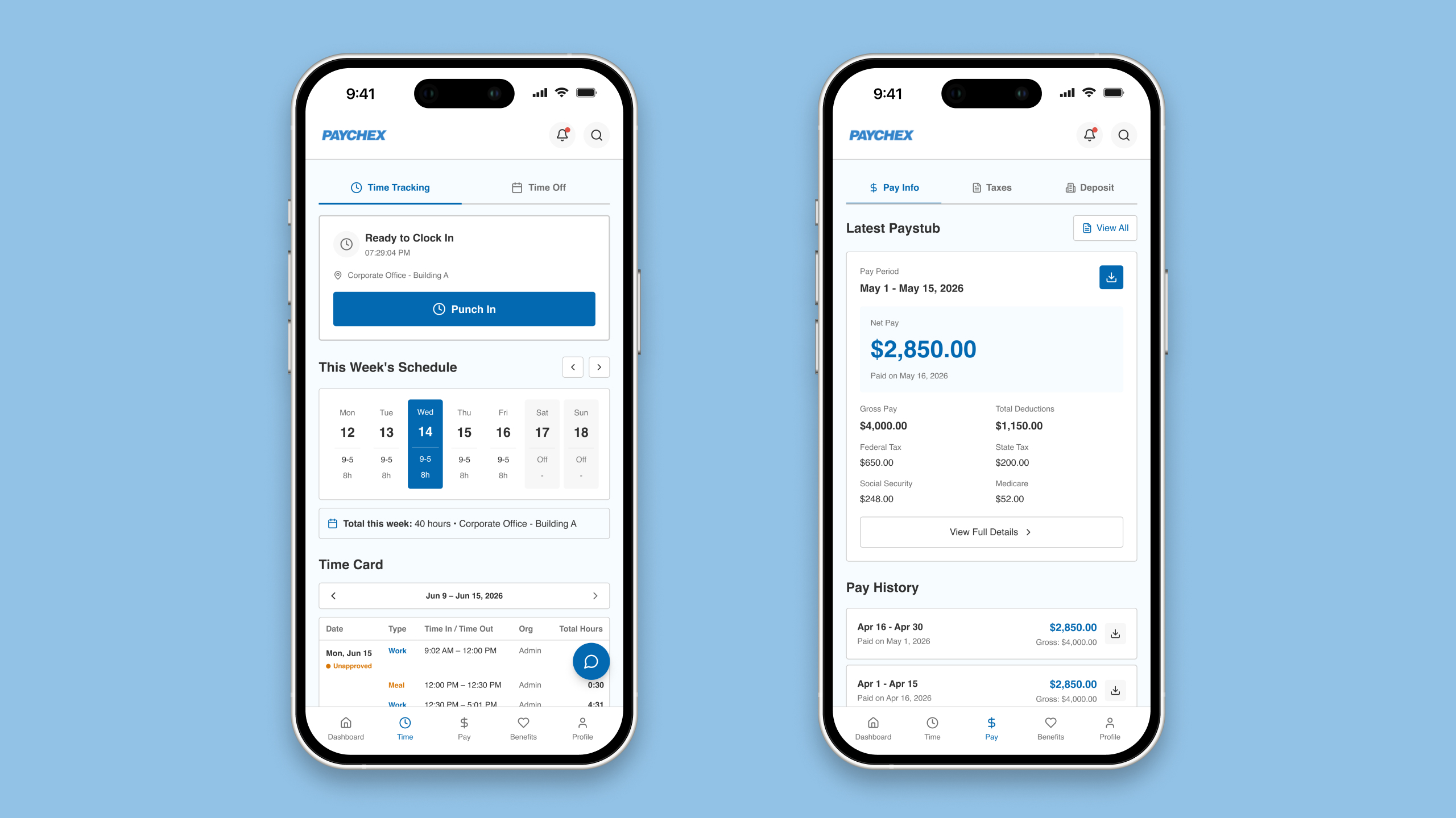
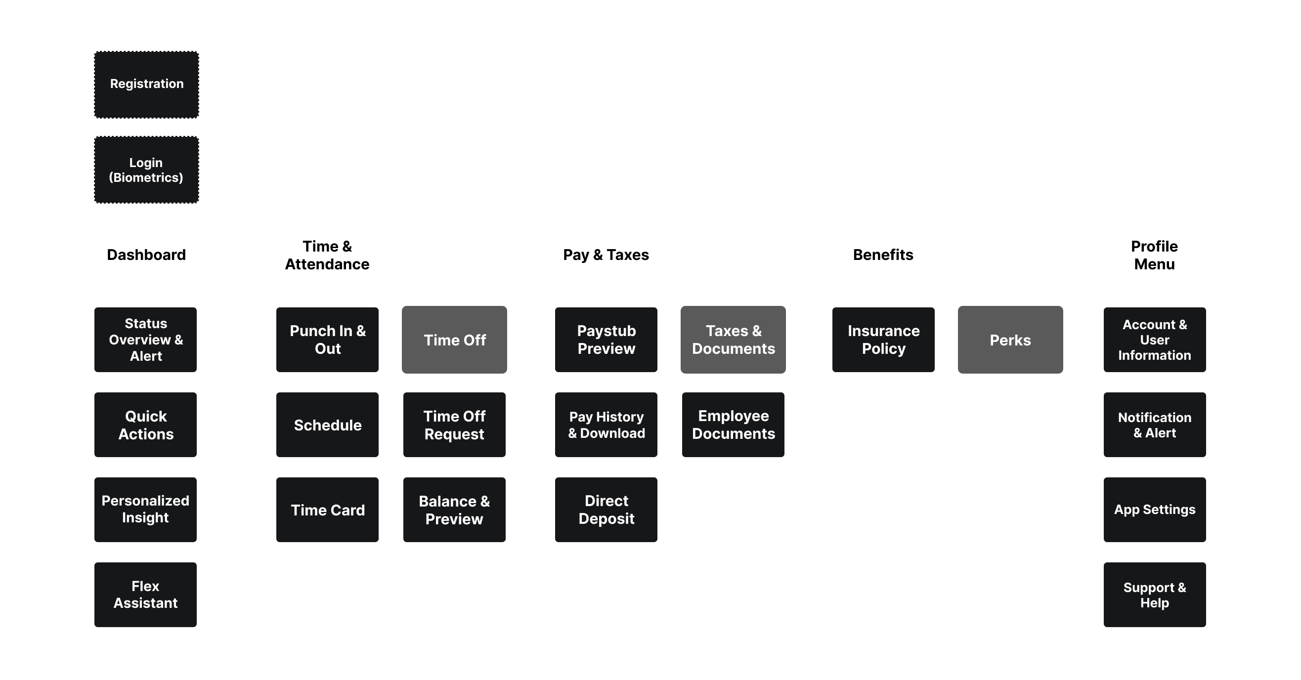
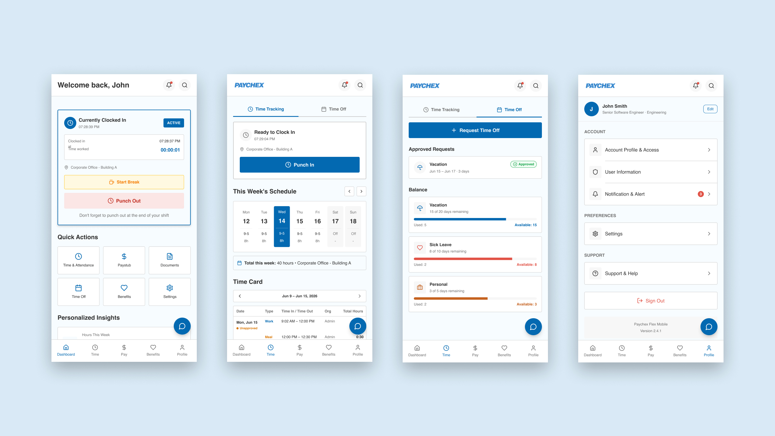
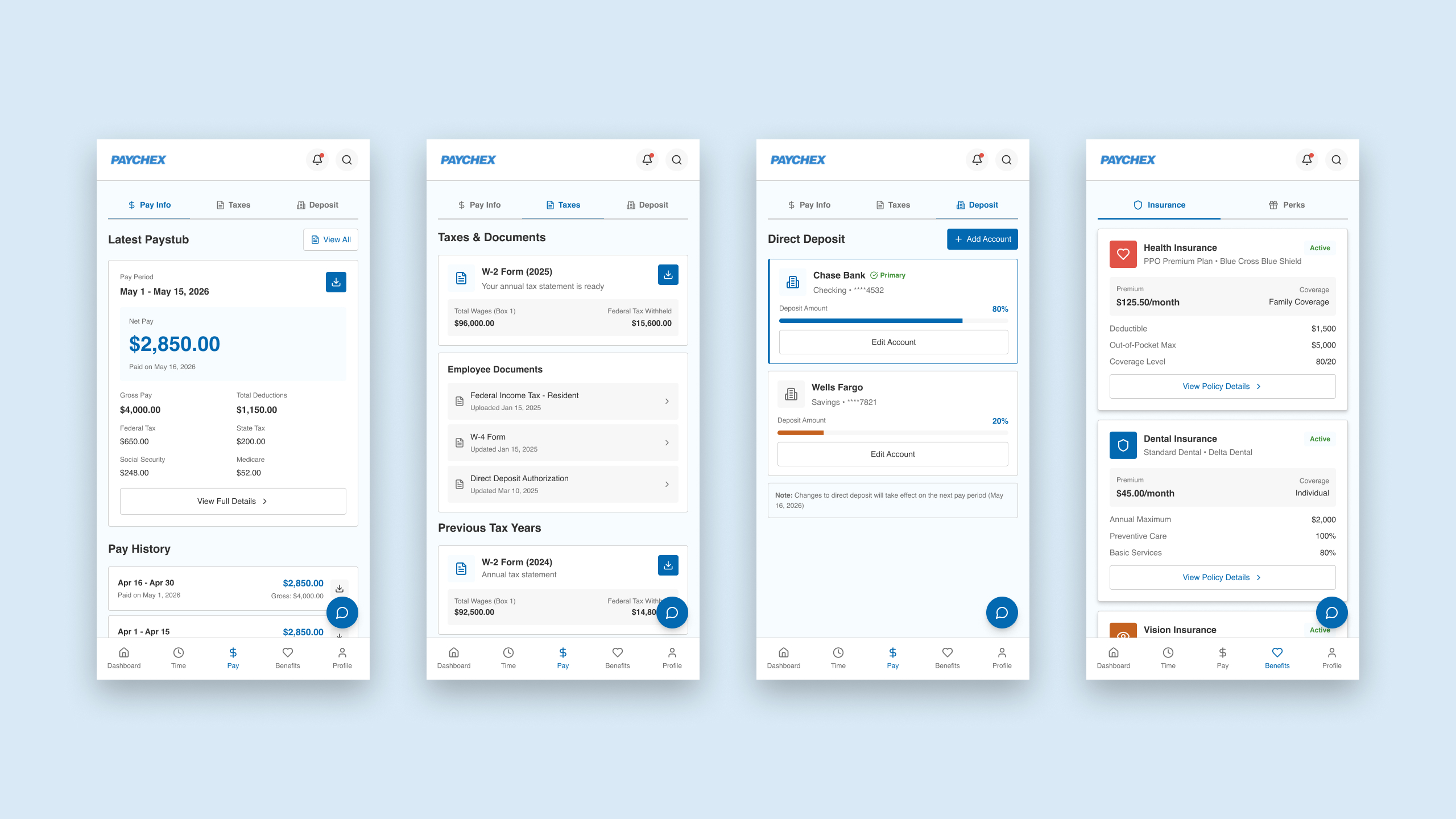
Lead the product design to transform dense legacy interfaces into intuitive mobile workflows for enterprise employees, modernizing the end-to-end experience for daily tasks like clocking in/out, viewing paystubs, requesting time off, and managing benefits.
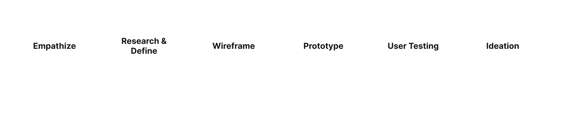
Every design tasks from Paychex Flex were completed by following 6 steps below.
Focusing on the Employee's daily workflow tasks, modernizing the navigation to reduce the steps to get the tasks done for the employees.
To maximize efficiency and accelerate the design lifecycle, I integrated an ecosystem of advanced AI tools. By automating heavy data synthesis and early-stage visualization, I was able to dedicate more focus to strategic problem-solving and cross-functional alignment.
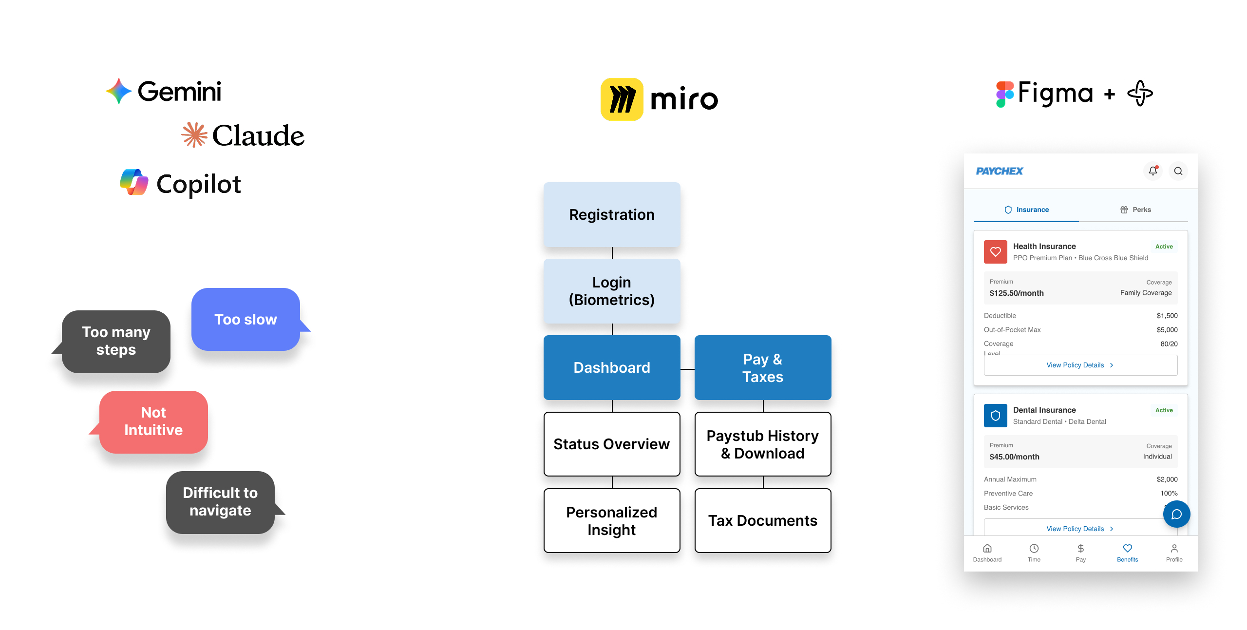
Data Synthesis & Insights (Gemini, Claude, Copilot):
Instead of manually combing through raw, fragmented user feedback, I leveraged LLMs to quickly analyze, categorize, and extract patterns from qualitative data. This drastically cut down the time required to pinpoint critical user friction points.
Rapid Sitemapping & Ideation (Miro Assist):
Using Miro’s AI capabilities, I translated those synthesized pain points directly into structured user flows and sitemaps. This automated the initial scaffolding phase, allowing for immediate visualization of the user journey.
Accelerated Execution (Figma AI):
I utilized Figma's AI capabilities to transition swiftly from structural sitemaps to high-fidelity component UI. To streamline the handoff, I leveraged AI to generate contextual micro-interactions and wire up the interactive prototype automatically.
By shrinking the time between discovery and high-fidelity prototyping, I was able to deliver a mature, validated solution to the Product Owner ahead of schedule. This fast-tracked our implementation alignment sessions and allowed engineering to begin technical scoping with zero ambiguity.
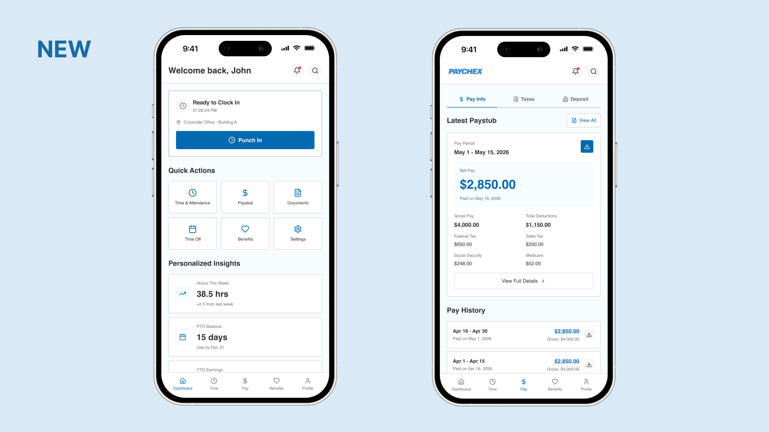
User feedback and analytics revealed that the existing navigation pattern on the Paychex Flex mobile app felt unintuitive on smaller screens. Employees were struggling to find routine tools, leading to drop-offs, user frustration, and increased friction during time-sensitive tasks.
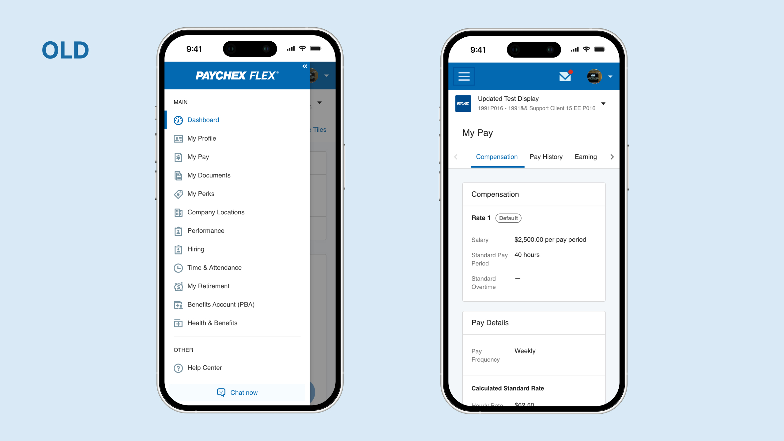
Rather than overwhelming the mobile viewport, I audited user behavior data to isolate the top 5 most frequently used employee functions (such as viewing paystubs, clocking in/out, and checking time-off balances).
The Outcome
By establishing a strict 3-click maximum for core workflows, I transformed a fragmented navigation structure into a highly intuitive, task-focused mobile experience. Presenting this streamlined flow to the Product Owner allowed us to secure immediate alignment, as the design directly tied user efficiency to measurable mobile engagement metrics.
To validate the updated navigation architecture, I conducted a mixed-methods (qualitative and quantitative) usability study with both internal and external users, including everyday employees and administrators.
Gathering Insights & Iterating
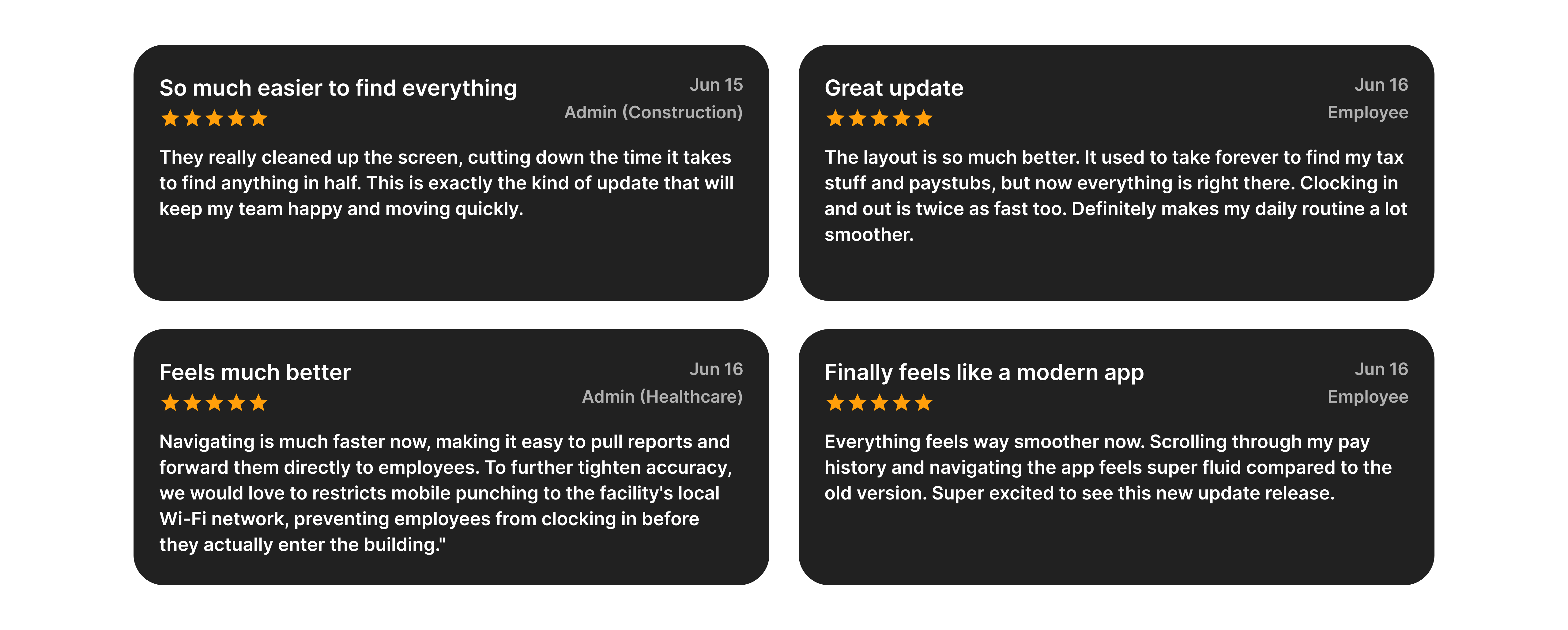
The overall sentiment skewed heavily positive, confirming that the new flow was significantly more intuitive. During the qualitative sessions, several employees provided highly actionable feedback regarding micro-workflows in their daily routines. I quickly synthesized these insights to run another rapid iteration, tailoring the final layout to map perfectly to their real-world operational needs.
The Quantitative Impact
By replacing the dense legacy interface with a streamlined, mobile-optimized navigation model, the quantitative metrics showed an immediate leap in efficiency:
Driven by direct user insights and behavioral analytics, this phase focused on translating employee pain points into optimized design solutions tailored specifically for Paychex Flex users.
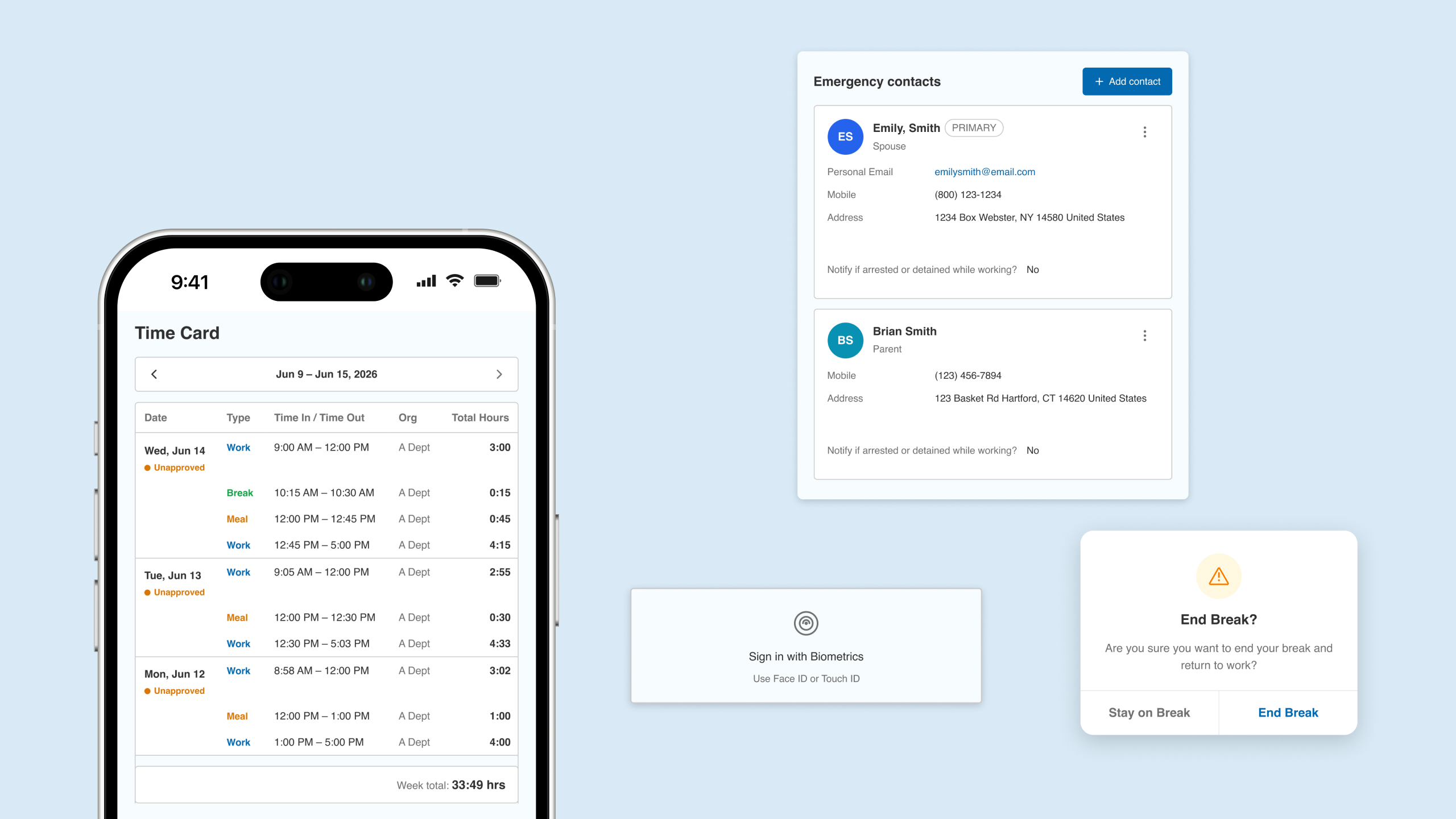
By analyzing real-world usage patterns, I transformed user frustrations into high-impact enhancements: implementing crucial quality-of-life micro-interactions, streamlining essential workflows like personal contact updates for payroll accuracy, and introducing deliberate confirmation layers to prevent accidental actions, such as prematurely ending a break.
Grounding every iteration in authentic user needs allowed me to deliver an intuitive mobile experience that actively protects employees from errors, reduces administrative friction, and elevates their daily work routine.
High Adoption & Excitement:
Employees expressed immediate excitement to test out and adopt the modernized Paychex Flex mobile app.
Effortless Document Management:
Users can now seamlessly find, view, and download critical tax documents directly from their mobile phones without administrative hurdles.
Frictionless Time Tracking:
The mobile punch-in and punch-out workflow was completely streamlined, allowing employees to accurately log their shifts on the go with zero hassle.
Elevated Satisfaction:
Overall user satisfaction scores increased significantly, with employees specifically praising the new navigation architecture for being vastly more intuitive and natural to use.
This project reinforced that successful mobile enterprise design isn't about packing the viewport with every available feature—it’s about ruthless prioritization. By shifting from a complex legacy desktop structure to a flat, mobile hierarchy, we turned a high-friction experience into a highly efficient daily tool.